Hello everyone!
Busy days! We are getting very close to finishing the development of Last Time I Saw You, so while you are still waiting I decided to bring you a new DevLog that I hope you’ll like.
In today’s post I’m going to talk about the Art of Last Time I Saw You and the references I’ve been working with while creating Ayumi’s world.
When I had the idea to start developing a game on my own, I was working as an art director at a company in Japan that focused on the localization and development of video games. Thanks to Yume Nikki: Dream Diary, the project that the team I was working with and I had just finished, I had the opportunity to learn how Unity works and the processes to follow when creating a game and bringing its development to completion.
I had the experience of having worked on a 3D game, although somewhat limited at that time, so I decided to play it safe and rely on what I already knew how to do best, which was to draw. For this reason I decided that Last Time I Saw You would be a 2D game drawn by me, since I would have more control over the final product and, by doing most of the artistic and visual tasks myself, I would reduce production costs considerably.
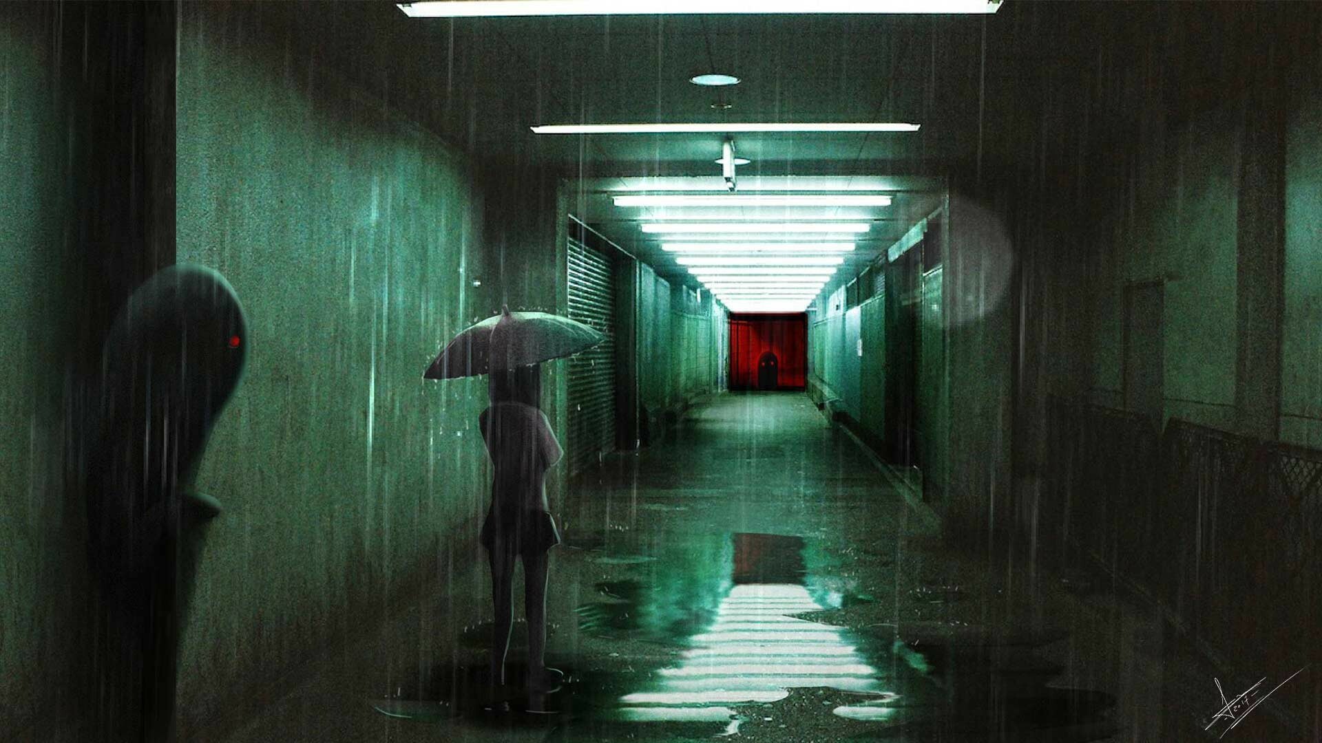
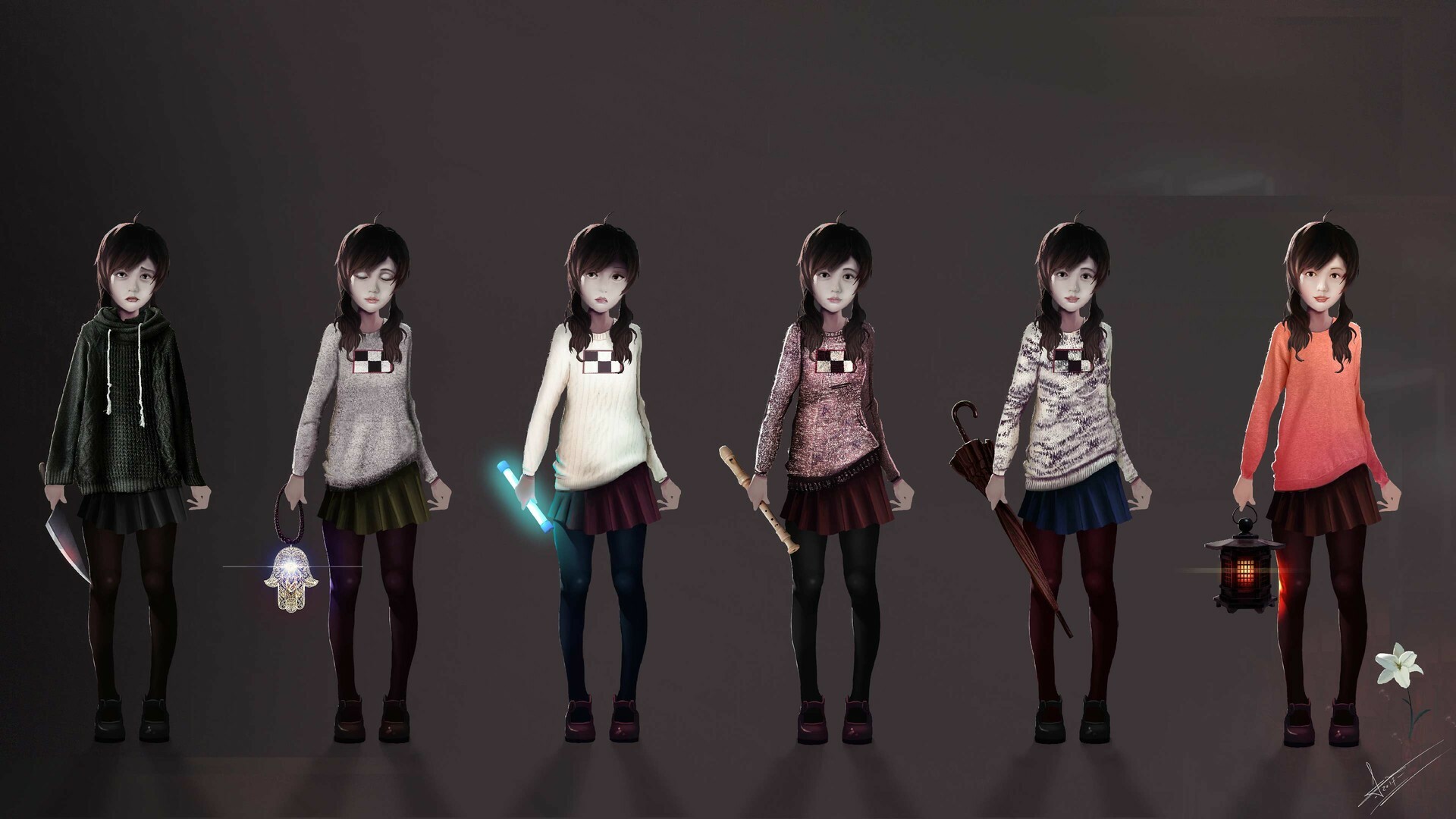
Once I had decided this, it was time to establish an artistic style. This is very important, as it will be the hallmark of the game. At that time, I was very interested in photorealism and photobashing techniques, which basically involves creating pieces by assembling various photo references and painting on top. The concepts of Yume Nikki: Dream Diary were actually made using this technique. Here you have some examples:


This style is usually used mainly in the concept art phase, but it has also appeared in some games as final art, being one of them Detention, by RedCandleGames. I really liked it and I was trying to get better at it, but the truth is that it wasn’t fitting very well with the story I wanted to tell with Last Time I Saw You.

It was then when I decided to get out of my comfort zone and started to try something new, something similar to Studio Ghibli and the anime from the 80s and 90s. In particular, it was the movie Only Yesterday, by Isao Takahata, that began to guide me towards a more defined and personal style. This, together with Makoto Shinkai‘s use of light and flares were the references that defined the direction I was going to take for Last Time I Saw You.


Background paintings by Kazuo Oga for Only Yesterday (1991), dir. Isao Takahata, Studio Ghibli.

Once I had practiced and defined this style enough, I started to draw backgrounds in Photoshop, following a polishing process until I ended up with the desired style.


And this is basically the creative and thought process I had in order to establish the art style of Last Time I Saw You! From time to time I still use photos as textures and then paint on top, but at the end I try to make it as hand-drawn as possible.
So I hope you liked this post and that you have learned a little more of the ins and outs of Last Time I Saw You. Let me know in the comments if you would like to know more about any of these techniques in particular!
In the next post I will talk about the animation process of our characters, which is also handmade!
Until next time! 💙
.Juan
